 English
  日本語
日本語  Deutsch


When ordering painted 3D printed parts, specifying a Pantone color is often only part of the color requirement. The final appearance also depends heavily on the selected spray painting finish. Matte, gloss, and metallic finishes can change how a color reflects light, how saturated it appears, and how closely it matches the intended visual reference.
This is why a Pantone color and a spray painting finish should be treated as two connected specifications rather than two independent choices. A color that works well as a standard solid coating may not produce the same appearance when combined with a metallic or specialty finish. Understanding this relationship can help prevent color mismatches and make the final 3D printed parts more consistent with your expectations.
Pantone Color and Spray Painting Finish Are Not the Same Thing
A Pantone color identifies a specific color reference, while a spray painting finish describes how the painted surface looks and interacts with light.
For example, a Pantone reference may define a particular red, blue, or green tone. However, that color can have a very different visual appearance depending on whether the surface is matte or gloss. A matte finish has lower surface reflection, while a gloss finish reflects more light and can make a color appear brighter, deeper, or more visually saturated.
Metallic finishes introduce another layer of difference. Instead of producing only a solid color, metallic paint contains reflective elements that create a shimmering or metallic appearance. As a result, a metallic color reference should not be treated as interchangeable with an ordinary solid Pantone color specification.
For this reason, specifying only “Pantone 186 C”, for example, may not fully communicate the desired result. A more complete requirement would include both the color and the surface finish, such as a specific Pantone color with a matte or gloss spray painting finish.
The key point is simple: the Pantone color defines the color target, while the spray painting finish affects how that color is visually expressed.
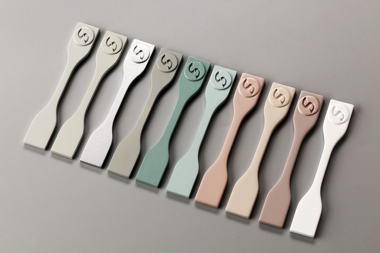
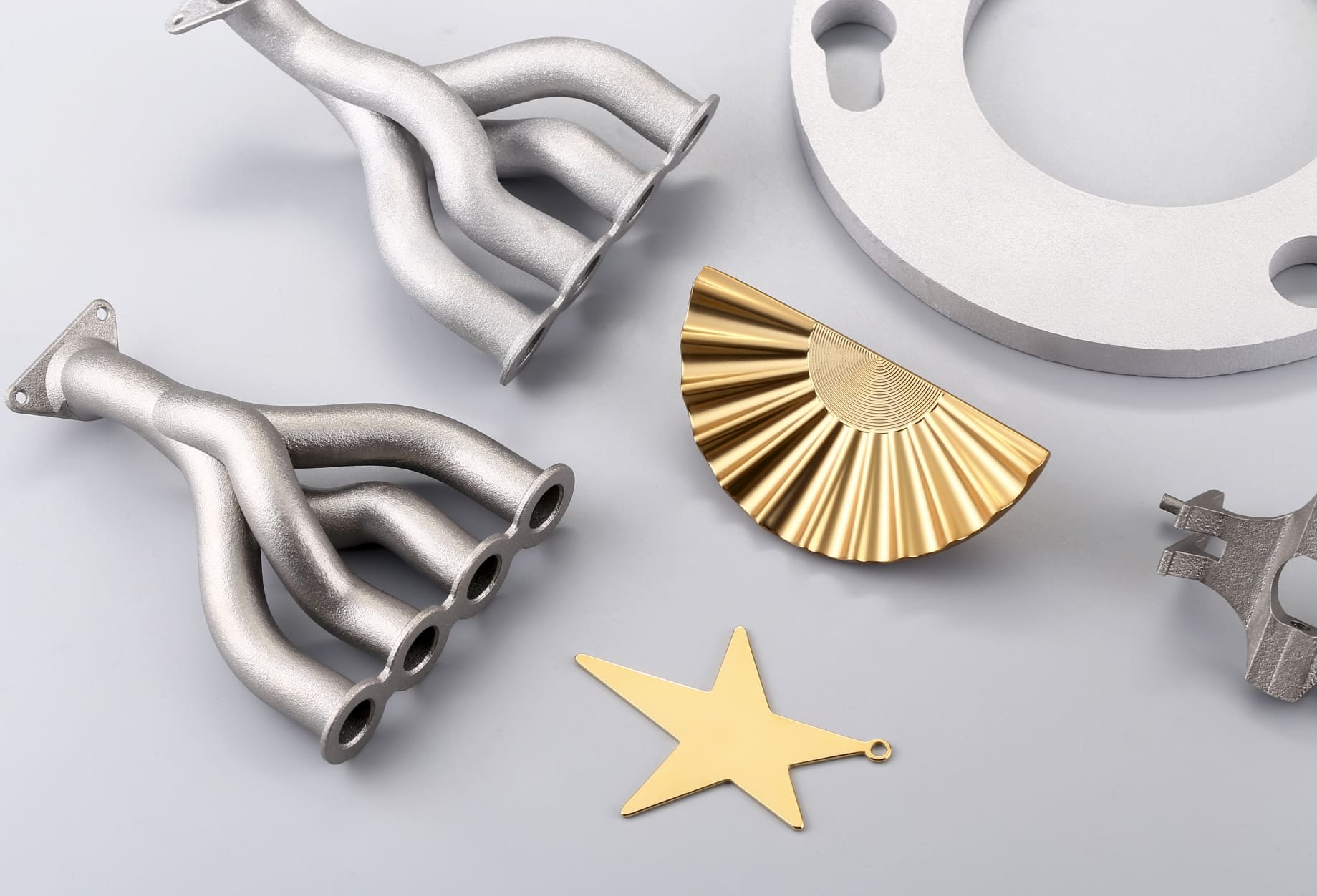
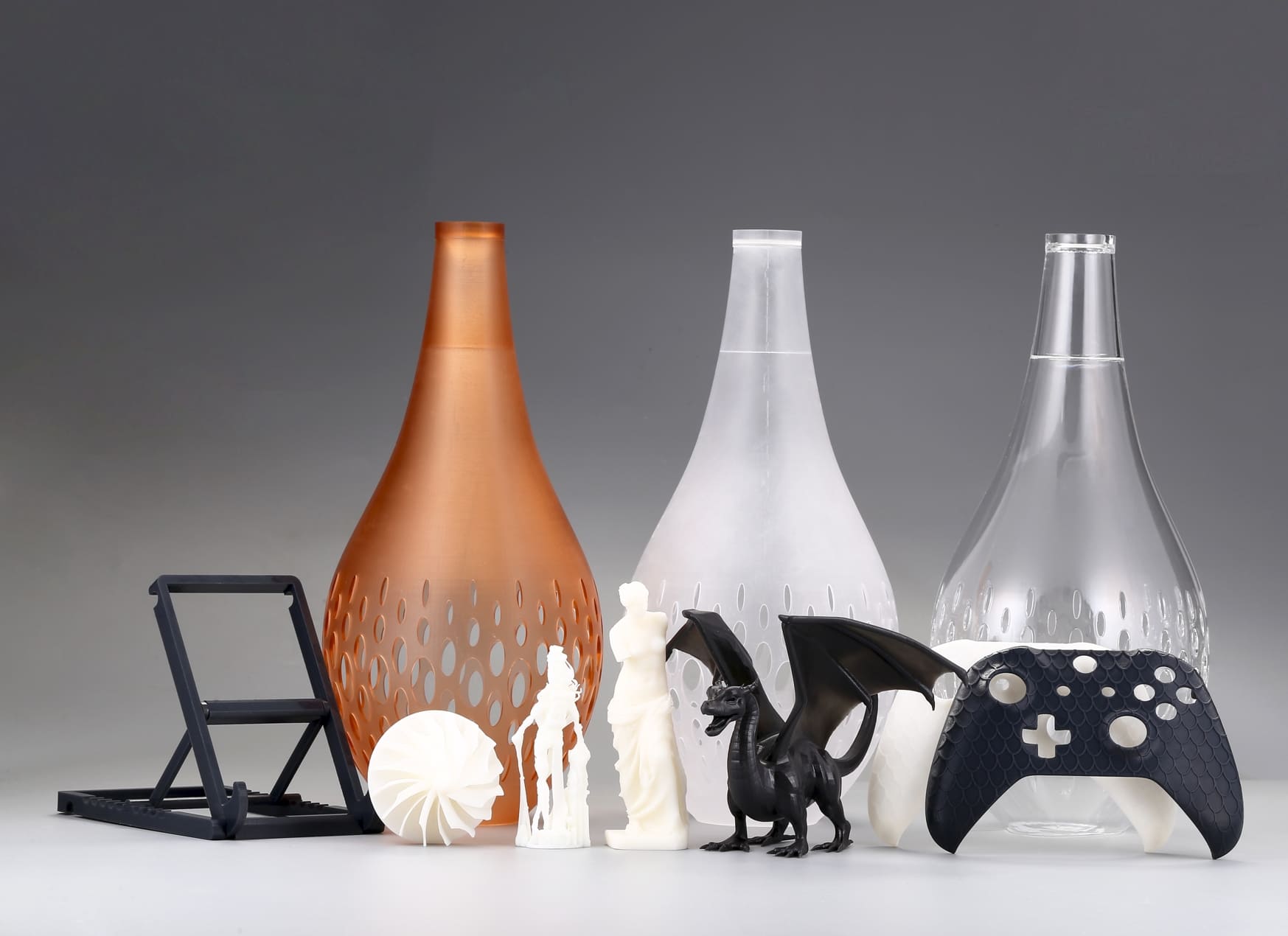
Image Copyright © 3DSPRO. All rights reserved.
How Spray Painting Finishes Affect Pantone Colors
Different spray painting finishes change the way light interacts with a painted part. Even when the same base color is used, the final appearance can be noticeably different.
Matte finish reduces surface reflection and creates a softer, more subdued appearance. Colors often look less reflective and more uniform across the surface. Matte painting can be suitable when the goal is a muted or understated appearance.
Gloss finish produces a smoother and more reflective surface. Light reflection can make some colors appear more vivid or visually deeper. Because reflections are stronger, the surrounding environment can also have a greater effect on how the color is perceived.
Metallic finish creates a different visual effect altogether. Reflective particles in the coating produce highlights and variations as the viewing angle or lighting changes, which means the final result is not simply the same Pantone color with more shine. The metallic effect itself becomes part of the appearance.
|
Spray Painting Finish |
Typical Appearance |
Color Consideration |
|
Matte |
Soft, low-reflection surface |
Colors usually appear more subdued and less reflective |
|
Gloss |
Smooth, highly reflective surface |
Colors may appear more vivid or visually deeper |
|
Metallic |
Reflective, shimmering appearance |
Requires a compatible metallic color specification |
|
Specialty Finish |
Customized visual effect |
Color and finish compatibility should be confirmed before production |
Some Pantone Colors Cannot Be Combined with Certain Finishes
One of the most common misunderstandings is assuming that any Pantone color can simply be applied to any spray painting finish.
In practice, color systems and coating types have to be compatible with the intended visual effect. Metallic Pantone references, for example, are designed to represent metallic appearances. They are not equivalent to standard solid colors simply because both are identified within the Pantone system.
This creates an important distinction when ordering painted parts. A customer may request a metallic Pantone color and then select a standard matte or gloss finish. However, producing that request as a conventional solid coating would not recreate the metallic appearance shown by the original color reference. Conversely, adding a metallic coating to a standard solid-color requirement can introduce visual effects that were not intended.
For critical color requirements, it is better to confirm both specifications before production. For example:
• Pantone color: standard solid color
• Finish: matte
• Or: Pantone metallic reference
• Finish: compatible metallic appearance
It helps avoid a situation where the numerical color reference appears correct on paper, but the finished part looks different from the expected result.
Pantone Color Matching in 3D Printed Parts
Color matching becomes even more important when the part is produced through 3D printing and then spray painted. The final appearance is influenced not only by the paint but also by the condition of the printed surface.
The printing material and its original color can affect the preparation process. Priming may also be required before painting to create a more suitable surface for the coating. Surface smoothness matters as well. A rough or uneven substrate can scatter light differently from a carefully prepared surface, which may affect visual consistency.
Part geometry can also create differences. Sharp edges, recessed areas, curves, and complex features may not receive paint in the same way as large flat surfaces. Lighting can further emphasize these differences, particularly on glossy and metallic finishes.
For these reasons, Pantone matching on a 3D printed part should be considered as part of a complete finishing process rather than as a simple color conversion.
When color accuracy is important, customers should provide the Pantone reference together with the desired finish and, when necessary, a physical color sample or visual reference. This gives the manufacturer a clearer understanding of the expected result.
It is also important to remember that a digital screen is not a reliable substitute for a physical color reference. The appearance of a color on a monitor can vary depending on the display, lighting, and viewing conditions.
How to Get More Consistent Color and Finish Results
The best way to improve color consistency is to define the color and surface finish together from the beginning.
Start by providing the exact Pantone reference and clearly stating whether you want a matte, gloss, metallic, or another specific spray painting finish. Avoid providing only the color number when the surface appearance is important. If the selected Pantone reference represents a special effect, confirm that the requested painting finish is compatible with it before production.
For demanding applications, it is also helpful to use a physical sample or approved color reference. This is particularly useful when the final part will be used alongside existing products, branded components, or other painted parts.
For 3D printed parts, 3DSPRO's Spray Painting Service can combine 3D printing with professional surface finishing, helping customers specify both the required color and the desired painted appearance. By confirming the Pantone reference and spray painting finish as part of the same requirement, customers can reduce the risk of an unexpected visual result and achieve a more consistent finished part.
Ultimately, successful Pantone color matching is not just about choosing the right color code. The finish matters just as much. When Pantone color, coating type, surface preparation, and spray painting finish are considered together, the final 3D printed part is much more likely to match the intended appearance.
 0
0


COMMENTS
- Be the first to share your thoughts!