 English
  日本語
日本語  Deutsch


Adding text directly to a 3D printed part is useful for labels, logos, serial numbers, instructions, branding, and identification marks. However, text that looks perfectly clear in CAD software may not reproduce with the same clarity after printing. Small letters, thin strokes, narrow gaps, and insufficient text depth can easily become blurred, merged, or difficult to read.
Whether you use embossed text or engraved text, the design needs to account for the resolution and limitations of the selected 3D printing process. The following guidelines can help you create text that prints clearly and remains readable after post-processing.
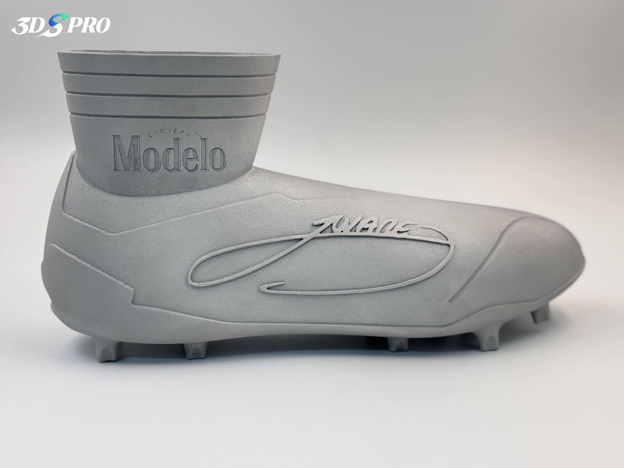
Image Copyright © 3DSPRO. All rights reserved.
Why Small Text Is Difficult to 3D Print
Small text contains fine features that may approach or fall below the practical resolution of a 3D printing process. When letters become too small, thin strokes can disappear, while narrow gaps between characters may close during printing.
The problem can become more noticeable when the text is placed on a curved, angled, or uneven surface. Printing orientation can also affect how accurately the edges of individual letters are reproduced.
Post-processing adds another consideration. Sanding, polishing, painting, coating, or other finishing operations can soften sharp edges and reduce the visibility of small details.
For this reason, text should not be designed based solely on what is visually distinguishable on a computer screen. The actual printing technology, material, orientation, and finishing method should all be considered.
Minimum Text Size for 3D Printing
As a general rule, larger and bolder text is more reliable than extremely small text with thin strokes. When text approaches the manufacturing limits of the process, increasing letter height and stroke thickness can significantly improve readability. Uppercase letters are often easier to reproduce than small lowercase characters because their shapes tend to be simpler and more recognizable. Text should also have enough spacing between characters to prevent adjacent letters from merging.
For a general starting point, use a minimum character height of 2–3 mm, and choose 3 mm or larger when readability is important.
References:
• Minimum text height: 2 mm
• Preferred text height: 3-5 mm
• Minimum stroke thickness: 0.8 mm
• Safer stroke thickness: 1.0-1.5 mm
• Minimum letter spacing: 0.6-0.8 mm
• Clearance around text: ≥0.8 mm
For critical markings, it is best to confirm the minimum printable dimensions with the manufacturer before production. A design that is technically printable may still not provide the visual clarity required for the final application.
Embossed Text Design Guidelines
Embossed text is raised above the surface of a 3D printed part. It is commonly used for logos, branding, labels, and identification marks. The raised text needs sufficient height to create a distinct boundary between the letters and the surrounding surface. If the embossed height is too small, the text may blend into the surface and become difficult to identify.
Stroke thickness is equally important. Very thin raised lines can become weak or lose definition during printing. Increasing the stroke thickness makes the letters more robust and improves their visibility. Adequate spacing around embossed text is also recommended. Leave enough clearance between letters and nearby edges, holes, ribs, or other features so the text does not visually merge with surrounding geometry. For parts that will be sanded or polished, consider making embossed text slightly more prominent because post-processing can reduce the sharpness of raised details.
For a general production design, a practical target is at least 0.5 mm, with 0.8-1.0 mm preferred when the text needs to remain clearly visible after post-processing.
References:
• Text height: 2-3 mm
• Embossed height: ≥0.5 mm; 1.0 mm preferred
• Stroke thickness: ≥0.8 mm; 1.0-1.5 mm preferred
• Clearance from nearby features: ≥0.8 mm
Engraved Text Design Guidelines
Engraved text is cut into the surface of a part rather than raised above it. It is useful for permanent markings, product identification, instructions, and areas where raised text could be exposed to wear. The most important consideration is engraving depth. If the engraved text is too shallow, the letters may become difficult to see after printing or surface finishing. A deeper engraving creates a more noticeable contrast between the text and the surrounding surface.
However, excessive depth is not always better. Deep and narrow cavities can be difficult to clean or finish, particularly when the geometry restricts tool or finishing access.
Engraved text should also have sufficiently thick strokes and adequate spacing between characters. Avoid extremely narrow openings that may be partially closed or filled during printing. When engraved text is intended to remain visible after painting or coating, consider how the finishing layer will affect the depth and contrast of the letters.
For general-purpose 3D printed parts, a practical target is at least 0.5 mm engraving depth, while 0.8-1.0 mm is preferable when the text must remain visible after finishing.
References:
• Engraving depth: ≥0.5 mm
• Preferred engraving depth: 0.8-1.0 mm
• Stroke width: ≥0.8 mm
• Letter height: ≥2-3 mm
• Clearance from adjacent features: ≥0.8 mm
Line Thickness, Spacing, and Text Depth Recommendations
Line thickness and spacing determine whether individual letters remain separate after printing.
References:
• Minimum stroke width: 0.8 mm
• Preferred stroke width: 1.0-1.5 mm
• Minimum letter gap: 0.6 mm
• Preferred letter gap: 0.8-1.0 mm
• Embossed height: 0.5-1.0 mm
• Engraved depth: 0.5-1.0 mm
How to Choose the Right Font for 3D Printed Text
Font selection directly affects whether the numerical dimensions above can be achieved.
Choose bold or regular-weight sans-serif fonts with relatively simple letterforms. Avoid highly condensed fonts, extremely thin strokes, decorative serifs, and tightly enclosed counters when the text is smaller than 3 mm.
As a practical rule, use 3-5 mm text height with a 1.0 mm or thicker stroke for general-purpose production marking. For highly detailed resin parts, smaller text may be possible, but it should be validated against the specific printer and material.
Design Tips for Clear 3D Printed Text
For the most reliable results, use the following checklist:
√ Text height: Use 2 mm minimum, with 3-5 mm preferred.
√ Stroke thickness: Keep strokes at least 0.8 mm, preferably 1.0-1.5 mm.
√ Embossed text: Use 0.5 mm minimum height, with 1.0 mm preferred for demanding applications.
√ Engraved text: Use 0.5 mm minimum depth, with 0.8-1.0 mm preferred.
√ Letter spacing: Maintain at least 0.6 mm, preferably 0.8-1.0 mm.
√ Font: Choose a simple, bold, readable font rather than a thin decorative typeface.
√ Orientation: For FDM, place text parallel to the XY plane whenever possible.
√ Finishing: Increase text dimensions when sanding, polishing, painting, or coating will be performed.
√ Technology: Confirm dimensions against the selected process rather than applying one universal minimum.
 2
2


COMMENTS
- Be the first to share your thoughts!